Friday, July 11, 2014

Don't Know If It's Just Vanity, But I Think This DIY Transformation Rules!


Well I don't know about you, but I'm all about getting the most "bang for your buck," when it comes to upgrades in my home.  We have a very limited budget to address home improvements.  With a 20+ year old home, the list of "things to do" is endless!

We did a little aesthetic upgrade to our guest bathroom a few years ago that included removing some hideous navy, floral wallpaper (can you say "busy?").  We painted the room a beautiful, watery, blue and added beachy beige accents.  Then we replaced the old shiny brass mirror and light sconces.  A new shower curtain and Voila!  It was quite an improvement, but still the dilemma of what to do with the vanity weighed on me.  The wood finish was scratched and worn (it actually looks better in the pic here than it did up close and personal!), the counter-top was white Formica, clean but not as nice as it could be.  The old faucet with the crystal ball handle-you know the one-well it had to go!  So the question was what is the cheapest way to revamp it while still achieving an upscale look? 

One problem was that the vanity was a custom size so trying to buy another one led to the Goldilocks principal- it was either too big or too small- requiring us to make changes to the flooring.  Besides, those new ready to install vanities from the big box stores are made of particle board, not good quality wood like this one.

I knew the vanity would look great repainted in a custom grey color (mix of ASCP Graphite and Paris Grey) to match the mirror and fixtures and that I could do it for very little money, but to replace the counter-top proved to be quite expensive.  So here's where we had to get really creative! 


We created the illusion of a free-standing cabinet by adding "feet!
A darker glaze brings attention to the details!

We decided to repaint the vanity and to purchase a new standard sized granite counter-top from the big box store because it was so much more affordable.  It was about 3 inches too long.  After doing some research and watching several YouTube videos, we began the process of cutting 2 inches from the end of the counter-top touching the wall.  This resulted in a centered sink and a finished edge overhang on the other side of about 2 inches.  The standard overhang is about 1 inch, but we decided we could live with it, especially since it saved us about $400! 

Cutting granite was quite a new adventure for us...so we measured many times and approached it slowly and cautiously, but we did it!  The cut was neat, but it really didn't matter too much because we covered up the cut with the side splash.  Then we added a new faucet.  We are really quite proud of the results!  You won't find this vanity anywhere else because it is uniquely ours.

DIY's rule!


This post featured on http://www.apartmenttherapy.com/add-feet-legs-to-furniture-223748

Wednesday, May 21, 2014

Inspiration-Jump into Creativity


Patchwork Dresser
Patchwork Dresser by West Elm


I absolutely fell in love with this dresser when I saw it in West Elm.  I loved the square and rectangle shapes outlined in white to emphasize the different colors creating a patchwork effect.  The lines were clean and contemporary with a nod to mid-century modern design.  It left a lasting impression on me.

A few weeks later while shopping a local charity thrift store, I happened upon this beauty and it was actually mid-century design, not reproduction.  It was all one color of wood (As I am usually anxious to paint, I often forget to take a "before" pic, which is why I don't have one of this piece), but the shapes immediately made me think of that dresser from West Elm.

Of course, I typically work with paint, rather than stain, so I decided to create a similar concept by using four different colors of ASCP-Old White, Paris Grey, Coco and Provence.
Inspiration is often the jumping off point of design.  Sometimes it is the colors in a Persian rug.  Sometimes it's a picture in a glossy decorating magazine that stops us in our tracks.  Sometimes it is the texture of a shell, rock, bark, or other element in nature.  No matter what it is that inspires you, it is possible to reinterpret it in your home design.  I used the West Elm dresser as my inspiration, but interpreted it using my own choice of colors.  I chose to leave the natural wood as my way of outlining the squares and rectangles.  Don't be afraid to trust your own instincts about what will work best for your particular design.


These sweet little antiqued gold knobs were exactly like the ones on the dresser.  I think that's what really caused me to connect with my inspiration piece.  It was also these four drawers and the four squares in the doors that helped me to determine that I would use four different colors, rather than repeat just two or three.


Here's the finished piece, inspired by the other dresser, but uniquely my own.  Love that!  Who knows maybe mine will inspire you!

Thursday, November 14, 2013

PAINT...The Great Unifier!


I love paint!  It is the perfect tool for transformation!  Old and worn out? Paint makes it new again!  Need to tweek the color to fit your new color palette?  A little paint on the details or a wash of color can make any piece "just right!"  One of my favorite things about paint is the way you can create "sets" of pieces that do not really match.  Need a new bedroom suite of furniture, but can't afford to buy all new pieces?  Find furniture in a style that coordinates with the pieces that you already own and then unify them with paint.

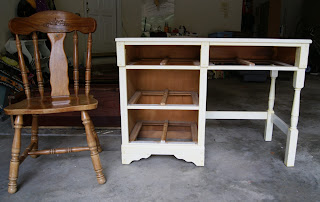
That's what I did with an old desk that we had.  My daughter was moving into her first college apartment this year and she had little room for anything more than her bed.  So when space is limited, think vertical!  We decided that a desk with storage above would offer her the most versatility.  So we started with this truly awful little desk, which was well made, but covered in yellowing lacquer.

Then we picked up a cute chair with turned legs similar to those on the desk.  It was only $3.00!


Now, we needed a hutch!  I don't know about you, but I see these all the time at thrift stores or on Craigslist.  The owners decide to discard them, but keep the original desk or buffet it sat upon.  They are usually pretty affordable, since they are missing their counterpart.

We just made sure that we found one that fit within the measured width of the desk.  We picked up this beauty at Habitat for Humanity's Reuse Store for just $15. It's a great way to help a good cause, too!


Now as you can see, this is a mismatched set of objects in three different finishes.  In walks PAINT...the great unifier!  I decided to paint the pieces in ASCP's Aubusson Blue and to draw attention to the beautiful details by showcasing them in Florence. Yet another dimension was added by doing a wash of Florence over the Aubussion Blue on the arches of the hutch and the back of the chair.


Here's the finished product!  Three mismatched, discarded pieces find a new home and serve a new purpose together.  Unity!


Tuesday, October 15, 2013

Plain Vanilla... the French Provincial Buffet

So, it's been forever since I wrote a blog entry.  I was busy with summer, vacations and life, I guess.  But I did manage to get a few pieces painted for my daughters.  Here's one of them.

This French Provincial buffet was quite a find at only $45.  I was excited about painting it and began to dream of the possibilities when my teenage daughter decided to claim it as her own.  She wanted to redo her room and use this one long piece to replace two pieces, an old dresser and a vanity.  She really, really, really needed the extra storage for all of her clothes...and so it became hers. 


Her room is painted with two walls in bright orange and the other two in magenta.  I'm not sure how she gets any sleep in there, but it certainly is bright and cheerful.  We were to be placing this piece on the orange wall.  When I asked her what color she wanted, her answer was white.  My dreams of a two toned piece that played up all of the interesting details were dashed.  Plain vanilla it is!  We decided to go for a high contrast look, by painting the hardware in oil rubbed bronze.  It is missing one pull, so I'm working on finding a suitable replacement.


It's a classic and it looks just right against her orange wall with all of her colorful artwork.  There is plenty of room to hold all of her clothes! So now I find myself wondering why are there still so many clothes on the floor?

Thursday, May 9, 2013

Plan B

So sometimes, things just don't go the way you've planned.  Do you know what I mean?  You have this vision and when you try to actualize it...well, it just doesn't look anything like the picture in your head.  That's what happened to me recently with this tray table.  When I saw this piece, with it's simple clean lines and dark brown finish, I had a plan.  Well, long story short, this piece started out as a rough coat of Old White with plenty of the dark wood showing through and a stencil...gone wrong.


Well, what to do?  I know!  That great new color I just bought, Florence! So I was "off to the races," again!


I decided to distress this table.  I just love the juxtaposition of the clean, more modern lines of the table, with the well-worn look that the distressing suggests...as though this table has been around forever.  I think that makes it a very interesting piece.  

Surprise!  Turns out that my little "mistake" added another layer of color and dimension to the finished look.  I love that!  Well, maybe Plan B isn't so bad after all!


 Of course, this table would be great as a sofa table or a foyer table with a couple of lamps and some favorite treasures.  

But I thought the tray- top of this piece, made it perfect as a serving piece.  Here, I have set it up as a 'bar" for serving wine.  This table is simple and lightweight, which also makes it very versatile.  It can be moved around and used for any number of purposes. 

Tip:  When having guests over for an event, consider rearranging your furniture for better seating and conversation.  Repurpose pieces, like this table, to serve a new function.  This could be a wine, an appetizer or a dessert station.  Pull up a couple of chairs and it could even serve as extra table seating, in a pinch. 

That's what creativity is all about.  There is always more than one way to do something.  Think outside of the box!   Use your stuff in new ways!  Move it around! Don't be too stiff!  Be flexible!  That's what I had to do with this design.  This is also true of life in general.  Sometimes you just have to shake things up!  Sometimes Plan B offers something even more interesting, exciting and unexpected! 

Thursday, April 25, 2013

Heading to the Raleigh Flea Market

Well if the weather permits, I plan to head to the Raleigh Flea Market this Saturday, April 27th from 9AM to 4PM.  Looking good so far! Well have some furniture, some home decor items, including planters, chalkboards, coat racks, picture frames, and candlesticks.  Stop by and see us!

Here are just a few of the items that will be for sale this Saturday


Monday, April 1, 2013

Striking Stripes


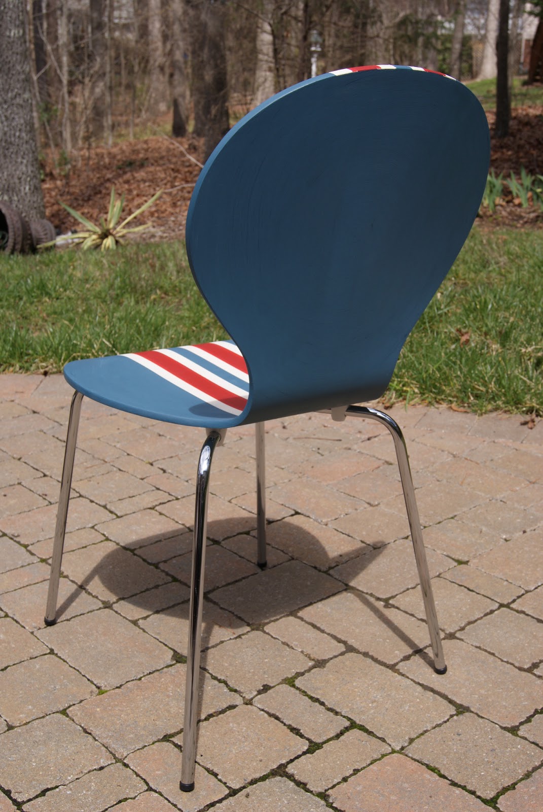
These adorable blue chairs caught my eye at a thrift store.  They were a lovely shade of blue, but they had a few little nicks in the paint.  Inspired by a chest I saw on a blog, with a Union Jack flag painted across the front, I decided to paint these with a striking "patriotic" stripe.  For the blue, I custom mixed a blue shade.  Then added ASCP in Old White and Emperor's Silk.

The blue paint was applied first in a circular motion to accentuate the shape of the chairs.  I did that on both the front and the back of the chairs.  I allowed some of the original blue paint to show through, adding a little texture and dimension.


Then I used 1 inch blue painter's tape to create stripes down the center of the chairs.  First, I centered one piece of tape down the length of the chair.  I did this by measuring and marking the center of the chair with a piece of chalk and then lining up the tape so that it was perfectly centered.  Then I put four additional pieces of tape on either side of the center piece of tape being sure to align the edges of tape without overlapping.  It is crucial to place the first piece of tape correctly, or else it will all turn out crooked.  

When I was finished I had a total of nine pieces of tape.  Next, I removed the tape on either side of the center piece, as well as the second to last piece on each end.  I painted these areas with the white paint.  Once this was dry, I replaced the tape over the white parts and then pulled the tape between them off.  I painted these areas red.  I then removed all of the tape, revealing equal 1 inch stripes of red, white and blue (which was the original color beneath the tape).
 
After seeing the result, I decided that I would prefer that the red stripe was wider, so I went back in and expanded the red stripe by once again taping off the area that I planned to paint. Had I planned that from the start, I could have used two pieces of tape together to create a 2 inch stripe of red.  But all's well that ends well.  Sometimes you just have to experiment a little. 


I decided to stripe only the front of the chairs and left the back sides blue, with the circular paint effect.   They would look great in a boy's room or as accent pieces anyplace that could use a little drama.