Had such a good time at the Raleigh Flea Market! It was so nice meeting all of the wonderful people who stopped by my booth. Your positive comments and feedback meant so much to me! Thank you! And to those who bought a piece to take home, a special thank you to you! I really appreciate your business!
Thursday, September 20, 2012
Wednesday, September 12, 2012
Raleigh Flea Market, Here We Come!
We're heading to the Raleigh Flea Market this Saturday, September 15th, to sell our stuff! We will be in Space 309. Check out the "Items for Sale" page to see the merchandise that will be at the flea market. Hope to see you there!
Friday, August 31, 2012
The "Write" Way to Repurpose a Drawer!
 Recently I purchased two drawers, that had somehow become separated from their proper home, so that I could use the attached hardware for another project. One day I was looking at these old drawers trying to think of another use for them because I absolutely hate to waste things and I really love to repurpose things! Repurposing is the act of using something in a different way than it was originally designed to be used. This is one of my favorite ways to decorate, too! It's always interesting to see functional pieces used in new ways. Think industrial carts with metal wheels turned into coffee tables. It adds a dynamic, surprising twist to your decor. It's so fun to create something that is "one of a kind!"
 I decided to turn them into organizational storage trays. I thought that they could be used to store all those smaller scrapbooking, sewing or craft supplies together. That way they could be tucked away in a closet or cabinet and then easily pulled out when it's time to work with them. I added a chalkboard front so that they can be labeled and two handles on the sides for easy carrying.
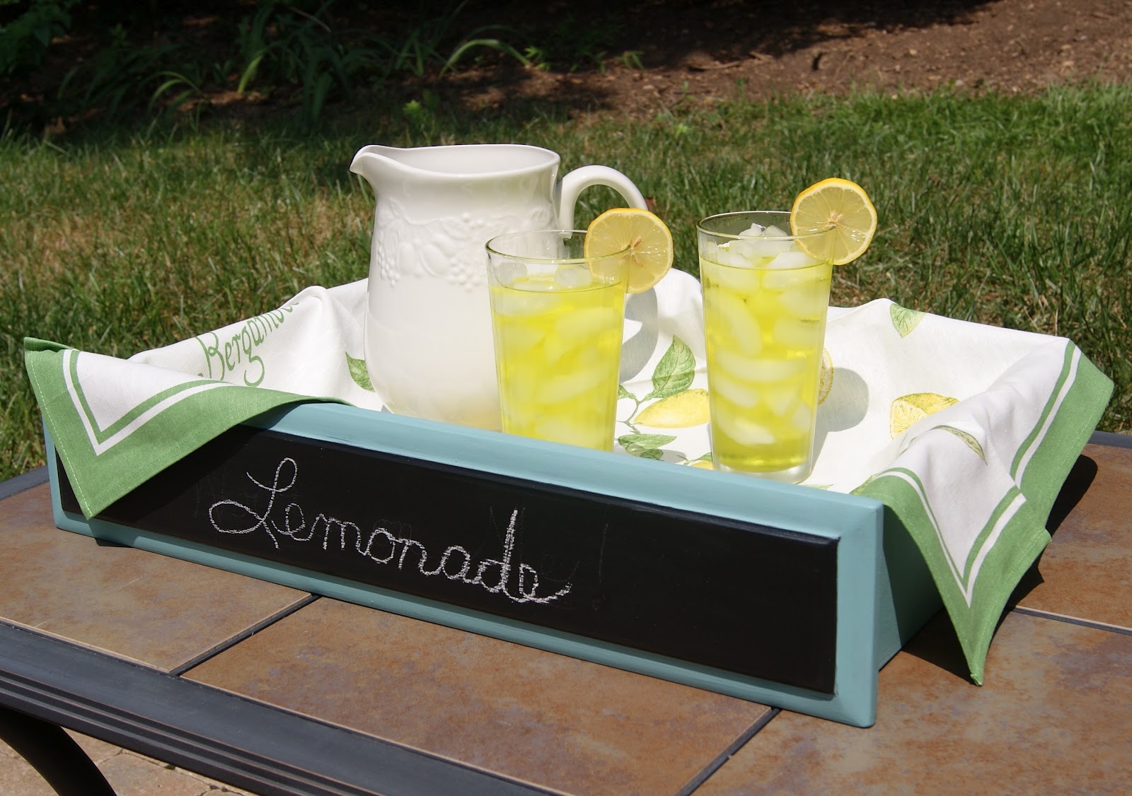
I thought they were just adorable and I realized that they would be great as serving trays as well. Imagine bringing your child's cupcakes to school with the message "Happy Birthday!" on the front. They would be great at those potluck dinners because you could write the name of the dish on the front, rather than answer the question "what is this?" over and over again. At a buffet style dinner, they add charm and an interesting design element. They could be incorporated into a beautiful tablescape to showcase the season, for example in the fall you could fill it with gourds, pumpkins, fall leaves and pine cones. Finish it off with a message like "Happy Thanksgiving" or "I am Grateful." Imagine all the ways that you could use one!
Linked Up to :
Wow Us Wednesdays
Linked Up to :
Wow Us Wednesdays
Sunday, June 10, 2012
From Formal to Dressy Casual
Back in the day, when I was growing up, people used to have a "formal" living room. You know the room I'm talking about. The one that you could only peak at from the hallway, but were never allowed to enter. The one that was beautifully decorated and reserved for some "special occasion" that never seemed to come. It stood as some sort of monument or tribute to a way of life reserved for the fancy and sophisticated, which apparently did not include you or your brothers and sisters. In fact, the room was rarely used in entertaining, leaving one to wonder "Who is fancy enough for this place?" These rooms were often furnished with Queen Anne style tables sporting elegant curved legs and a dark cherry finish, often a piano, and the finest of china and nick-knacks.
 |
| The "before" tables (that's a layer of primer on top of the coffee table) |
 |
| The "after" |
Many of us grew up to either create our own "tribute to fancy people" using this furniture, or we inherited these pieces from our family. When I had an opportunity to redo a set of Queen Anne tables recently, I couldn't wait to get my hands on them and "dress them down." Our lives today are far more informal than years ago. Formal attire once worn to the office, church and the theater has been replaced with "dressy casual" attire in an effort to make us all feel more comfortable. And that is the way we choose to live, too. The formal living room has been replaced by the "family great room," where you are encouraged to relax and get comfortable.
 These once formal tables were transformed into their "dressy casual" counterparts. I chose to create a look that might have been more characteristic of a farmhouse of yesteryear, but still having the elegant curves of their once formal lives. The bodies were done in Old White and then slightly distressed to look as though they had been around for years.
I layered the tops in a Coco and Graphite wash that gave them "character" and then distressed them too, to show the cherry wood underneath at the edges. The hardware, once shiny and gold, was repainted to an oil rubbed bronze.

Saturday, May 12, 2012
"Oh, it's so You!"
Easter
and taxes and birthdays, oh my! These are just a few of the things
that required my attention in April. It's been a whirlwind! But I did manage to get a few things painted, too. A lovely
friend sought my help in creating a custom table for her beach house
that would work with her new color scheme. We decided to layer a
Provence teal with a Napoleonic Blue. The result is this beautiful
beachy blue that looks wind swept and sun bleached. Ah, makes me long for the rhythmic sound of the ocean and a tall, cold Pina Colada! Oh, but I digress!

I also started on my daughter's bedroom furniture. This is an American of Martinsville end table, circa the 1960s, that belonged to my grandmother.
We decided to paint it in two tones to play up it's clean lines and
mid-century modern design features. We used Paris Grey and Old White to
get this quiet, subtle contrast. We also added new hardware. She
loves it and it looks great in her room! Just one end table, and one
dresser to go, but you get the idea!

Saturday, March 24, 2012
BAM!- Let's Kick It Up A Notch!

Sometimes, even though a piece of furniture is nice the way it is, you just need to spice it up a little. I decided that's exactly what I needed to do with this recent purchase, a Broyhill server. "Let's kick it up a notch!" That is the well known catchphrase of the famous chef from my hometown, Emeril Lagasse. Not only does his philosophy apply to food, it also applies to style.

BAM! The addition of some Annie Sloan Napoleonic Blue paint, took this piece from ordinary to extraordinary! When you add a pop of color to a space, it can bring it to life. Here we are able to do that without changing the wall color, but instead by working with the more neutral tones of the foyer. The color energizes an otherwise boring space. What a great way to greet your guests!

A little storage cabinet can serve a multitude of purposes. Small enough to fit just about anywhere, it is perfect here as a foyer/entrance table, a great place to store keys, book bags, or purses. It would also work as a flat screen TV stand, with plenty of space to stash away your DVDs and gaming equipment. It could provide extra storage in a bathroom, bedroom, living room or kitchen for just about anything. Of course, you could always use it as it was intended, as a server in your dining room. So why not spice up your life and "kick your style up a notch" with some painted furniture?
Saturday, March 10, 2012
A New Box of Crayons
These days, I'm either painting, or thinking about painting, or surfing the net for cool ideas (have you discovered Pinterest yet?), or shopping for furniture on Craigslist. A recent purchase has given me the opportunity to paint my largest furniture piece so far. It's a lovely hutch and buffet. I think it's maple, but I know it's a well crafted piece of solid wood and boy, is it heavy!

It took me about a week to get started, as I explored the color possibilities. Choosing your vision for the furniture can be the most challenging, but also the most fun part of the process. Remember when you were a kid and someone bought you a new 64 pack of crayons? Remember the excitement you felt about the creation of your masterpiece? What color will I use first? What will I make? Essentially, what is my vision? When doing a piece of furniture, I like to let it "speak to me." Does it lend itself well to a two-tone design? Should the color be demure or vivid?


My version of this hutch is a softer, watery blend of blues, greys and greens. The subtle variations of color are evident as you move closer to the hutch, but from a distance it looks like a soft, mossy green.
A pretty design on the sides of each drawer is revealed when you open them. 

Reminiscent of my childhood days, it is still so exciting when the creative work is done to stand back and admire my new "masterpiece!" I am quite happy with the results.

By the way, did I mention that this one is for sale? If you are interested, contact me for the details. Or perhaps you have a treasured furniture piece that could use a facelift, give me a call and we can look through my "crayon box" for your perfect color.
Subscribe to:
Posts (Atom)